Website and brand system for a Maine nonprofit serving veterans, military, and first responders — organizing a mountain of content into something that actually gets people through the door.
Who We Worked With
Revolution Fitness
Partners
Tye Newton & Frankie Day-Lyon
Services
Brand & Campaign, Web & Digital Systems
Project Fun Fact
3.5 x 2 inch business card that serves five audience segments
A nonprofit with a lifesaving mission and a mountain of content. We made it all make sense.
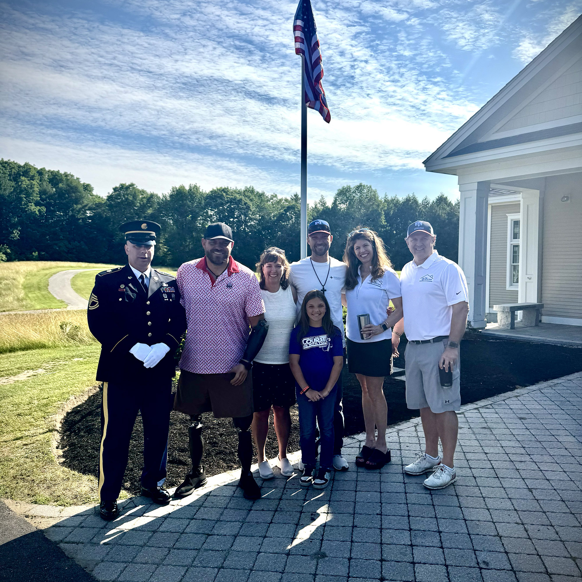
Revolution Fitness is a Maine-based nonprofit providing holistic wellness programs — fitness training, nutritional coaching, and mental health support — for active-duty military, veterans, police officers, firefighters, and EMTs. Their mission is urgent and their community is growing. Their problem was simpler: they had a mountain of content and no clear way to organize it.
Multiple service lines. Five distinct audience segments. Donation pathways, volunteer recruitment, event promotion, sponsor recognition, press coverage, testimonials, a partnership with the Travis Mills Foundation, and the personal stories of people whose lives had been changed. All of it mattered. None of it had a home.
Tye Newton designed an information architecture that makes every piece of content findable without making any single page overwhelming. The homepage flows like a story: mission first, then who the facility serves (with each audience named explicitly), then services with clear pathways to learn more, then the human impact through testimonials, then press coverage, then a “Get Involved” section with three distinct calls to action — refer someone, make a donation, volunteer — each with its own visual card. Sponsors get prominent, dignified placement. The Travis Mills Foundation partnership gets its own dedicated moment.
The key design decision: make it immediately clear who each thing is for. A veteran exploring services sees themselves on the page within seconds. A potential donor sees exactly where their money goes. A volunteer sees how to help. Nobody has to dig. That clarity is the architecture doing its job.
Credit to Burr Signs for the original logo, font set, and color palette. We took those foundational elements and built them into a full brand system — applying them across the website, business cards, and all digital materials with the consistency and intentionality that turns a logo into a living brand.
The result is a site that serves a complex nonprofit with the polish and clarity of an organization ten times its size. Revolution Fitness can now point anyone — a veteran in crisis, a corporate sponsor, a media outlet, a potential volunteer — to a single URL and trust that the right message finds the right person.