Three logos that show the range — from a research center at Massachusetts General Hospital to an anniversary campaign for the Asperger/Autism Network to a recording studio in Cincinnati. Each one built from dozens of directions down to a single mark that carries meaning in every curve.
Who We Worked With
Massachusetts General Hospital (CURE), Asperger/Autism Network (AANE), Jay Song Studio
Partners
Tye Newton
Services
Brand & Campaign, Web & Digital Systems
Project Fun Fact
Polled viewers independently identified the Jay Song logo as both a bird and a sound wave
From concept sketch to final mark — logos that carry meaning in every curve.
A great logo does more than look good. It carries the story of the organization into every context it touches — a glass door, an embroidered coat, an academic certificate, a concert poster. Tye Newton designs logos that do exactly that. Here are three that show the range.
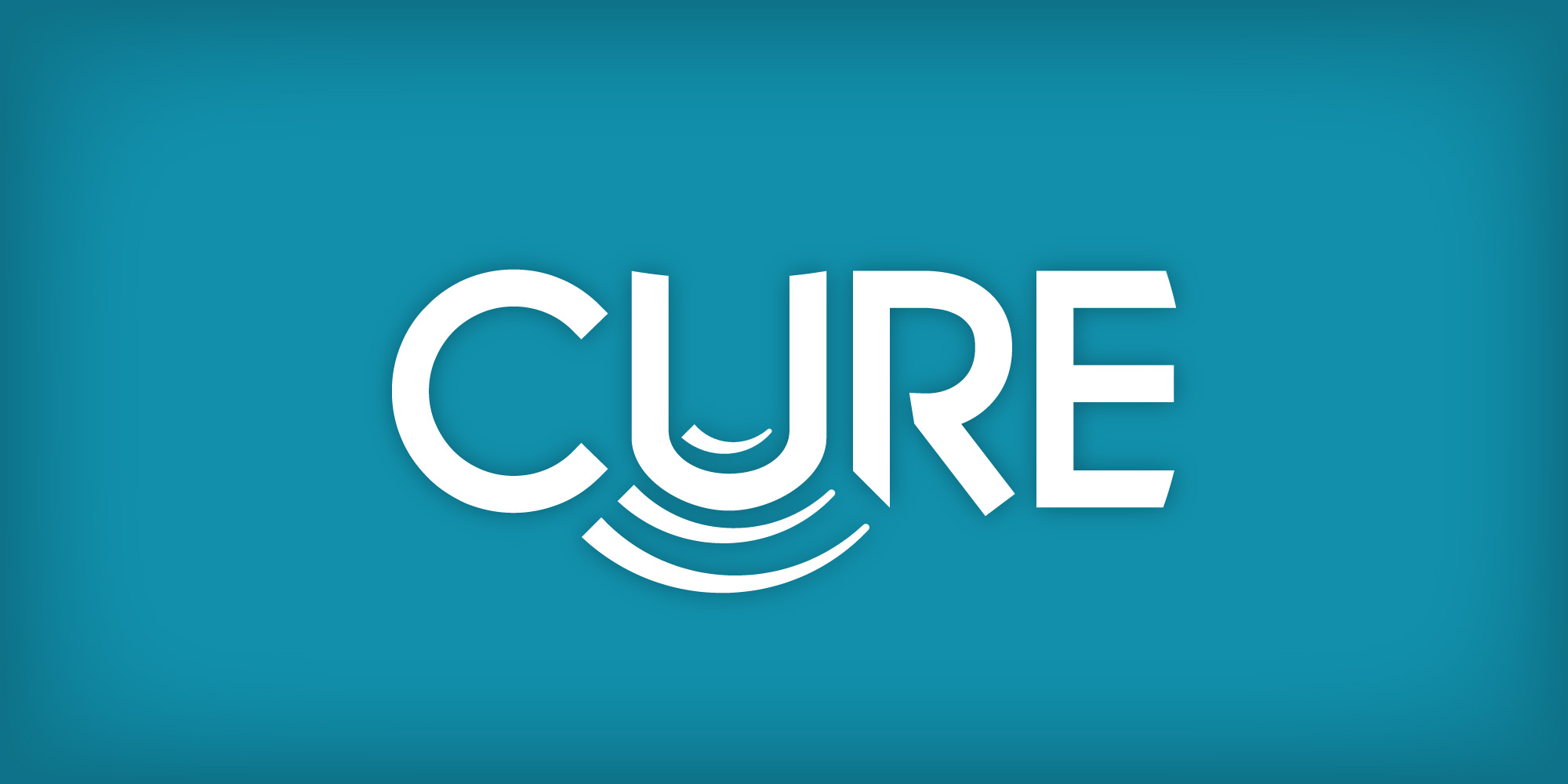
CURE — Center for Ultrasound Research and Education at Massachusetts General Hospital
MGH’s Emergency Ultrasound Division needed a mark for their new research and education program. It had to stand on its own on academic certificates while sitting comfortably alongside MGH’s historic shield logo. Tye built the entire identity around a single insight: the letter U doubles as an ultrasound probe, with rippling strokes emanating downward to form the familiar pie shape of an ultrasound monitor. The result is a logo that medical professionals recognize instantly — not because it’s labeled, but because the meaning lives inside the letterforms themselves.
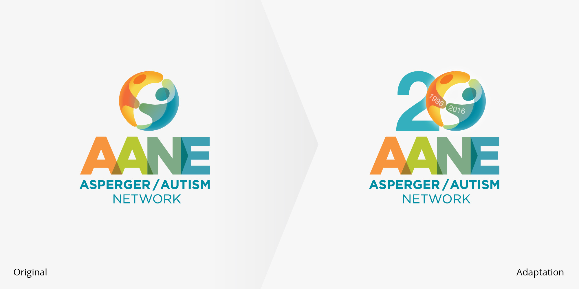
AANE — “20 Years, 20 Faces” Anniversary Campaign
The Asperger/Autism Network celebrated their 20th anniversary with a gala themed “20 Years, 20 Faces” — honoring the diversity of their community across two decades. The brief was clear: celebrate without overpowering the existing brand. Tye adapted the logo so the “20” integrates into the original mark with a subtlety most anniversary logos never achieve. Then he built the “20 Faces” mosaic — twenty images representing AANE’s people, including staff, contributors, historical figures, and even artwork from AANE’s artist collaborative — toned in brand colors and arranged uniquely for every context from save-the-date cards to the program book.
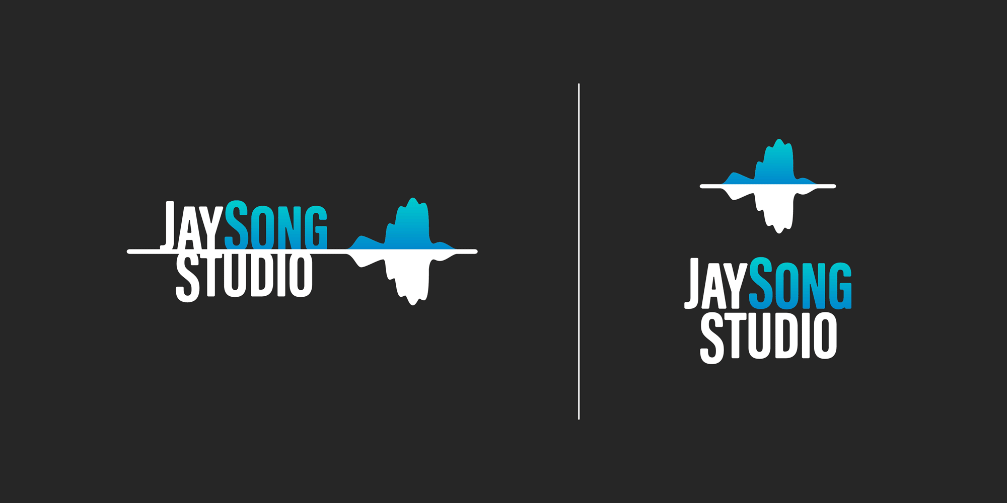
Jay Song Studio — Music Recording Studio Brand
A recording engineer in Cincinnati needed a brand for his purpose-built home studio. The name “Jay Song” — a play on his first initial and the idea of a songbird — gave Tye a concept to build from. The final logomark is an audio waveform in the silhouette of a jay, simple enough to scale to any size and original enough that polled viewers independently identified it as both a bird and a sound wave without being told.
What connects all three: every logo starts with dozens of directions, most of which get thrown away. The final mark only emerges after the concept, the context, and the craft align. That’s the work Tye brings to Partners in Design — not decoration, but meaning built into every curve.
